 This artwork was created for the Twitter Art Show. As anyone who Tweets will know, each message on Twitter has to be 140 characters or less.
A key requirement was that the piece must be 140 square inches or less. I took this idea and chose an 8″x8″ board box, and gridded it into 12″ by 12″ squares. This of course gives me 144 squares, over the 140 limit on Twitter. I left four of these squares completely unpainted, with the primer showing.
These blank squares represent those who have had their voices silenced, around the world, cut off from these networks of communication and information sharing that we in the West so take for granted.
The little Twitter bird sits on a branch, watching the messages travel around the branches of our networks.
Maybe my Artists Statement sums it up best (in 140 characters or less):
[12 sq. -4] = 140 squares of color, a grid of 144. Four squares are blank for the silenced voices. The Tree connects us; talk in the forest.
The Texas heat beat down on my head today, as I stood in a dappled creek. I had the most fun painting this en plein air oil sketch of the creek. This is expressive, colorful and crazy and I love it. Hope you like it too.

Exploring further the optical sensation of light through trees, I am working on two new art pieces that deconstruct the natural world around me. As I walk through the trees here in Texas, I see endless patterns of light like brushstrokes, organic shapes that nestle next to each other, some merging, some discrete. The tints and tones create form and movement to my eye, and I can focus on two distinct realities; that of the patterns that form the whole, or that of the whole.
My works focus on the patterns, in order to reconstruct a unique reality of the world around, a natural pointillism, uniform and yet lacking order. A more formal pointillism brings stillness; my organic pointillism brings movement and passion.
These works in oil on canvas are emerging over several weeks, layer after layer, color after color, shape after shape. They are both 40″ by 40″, and I hope to complete them within the next week.
I will update when they are complete! There’s so many more layers to go…

Works in Progress ~ Day One

Works in Progress ~ Week Two

Works in Progress ~ Week Three
 Broadway Boogie Woogie
Piet Mondrian (Dutch, 1872-1944)
1942-43. Oil on canvas, 50 x 50″
This painting by Mondrian was a huge influence on my evolution of my image (right), Trees Squared. The use of squares to create movement, the pulsing life, and the the varied colors all found their way undulating through my subconscious as I made it. In Mondrian’s piece and piece and my own, the circulation of the life in both the city and in nature as represented by the tree and my showing the vitality pulsing beneath the bark are captured. My organic picture however uses organic lines; the Mondrian masterpiece uses the geometry of architecture.

It is fascinating and endlessly inspiration to me to note the overlay of images I have as an artist as my images emerge. The references that I become aware of, and the many that remain in my subconscious have a huge impact on my art, although none of them were consciously selected. I guess that I could here assert that ‘art is plagiarism’ but I can also assert that, in a reverse syllogism, that “plagiarism is NOT art”.

Blue Skies (c) 2009 Alison Jardine. 30″ x 42″, oil on canvas
I am so happy to have completed this sunny, uplifting abstract work! It is a view of the sky through the branches of trees in the sunshine. The composition was inspired by the Japan-inspired textiles of the Art Nouveau period, and the rich blues, yellows, whites and golds reference this also. The flat ink-like branches add to this atmosphere, and add rhythm and movement to the softer patterns of the leaves, which are given depth through many colors of yellow, and also gold pigment.
This is a very decorative, beautiful work, full of movement and yet contemplative, and it has inspired me to create similar compositions with different colors, more abstract, and perhaps more Pop Art.
One of the great joys of painting, for me, if that immediate reaction to an element that inspires you as an artist; the pull can be so strong and absorbing. The hard work of settling on a form for the artwork is then followed by a wonderful sense of exploration of the unknown that happens when you embark on your painting, and the ongoing the response to the immediate image as it emerges. Sometimes, my paintings are exactly as planned, sometimes they surprise me!
This work is for sale, please email me if you would like to know more, or contact me through the Contact page on the navigation bar at the top.

My latest work is an abstraction that I have finally completed. This large square format (it is 56″ x 56″) is echoed in the squares of overlapping spring colors that cover the canvas. The squares as geometric shapes create a sense of flickering movement, never still, just like the restless leaves in the spring breeze. I worked from a photograph I took earlier this year, which I heavily edited to ‘sketch’ out my thumbnail. From this, I layered many layers of paint to achieve this final effect.
The trees branches, swaying in the wind, are dappled with purples, greys, and many blues effecting shadows and shifting light through the canopy. This painting captures the serene and joyful feeling of part of a living landscape: look more closely at the seemingly unchanging bark and see that it is full of pulsing life.
This work is for sale (email me if you would like to know more), and I am hoping to submit it for inclusion in many juried shows in the coming year.
 Two opportunities to paint this weekend, which means it was a good weekend. Both locations are in creeks in the local area. The first wide, white and grey, open creek is part of the North Sulphur River, which runs east – west across North Texas. The second is Post Oak Creek, in Sherman, which is snake-like, full of snakes, overgrown and full of flickering shadows and intense wet greens.
On Saturday, I managed just over an hour on my canvas before the skies opened and rain fell from thousands of feet, or so it seemed, to punch down on me and my canvas. I ran for the bridge and headed home with a very incomplete canvas. This one will probably not be one I complete. I prefer to finish my canvasses on location. I focused on trying to use creative brushstrokes to add feeling.
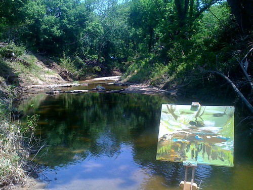
Monday lunchtime brought another opportunity to drag my art bag down steep slopes. This time, the sun blazed like a true Texas summer, dazzling me periodically when the trees and clouds swayed. On my way down the crumbling side of the creek, I paused to watch the rather large snake (rat snake, I think) slither away to shade. I thought I would give it its personal space… Even in the shade, the patches of light were hard to look at for long. My strokes were long and sinuous, like the tree roots and the shadows. I like the colors and shapes in this one. Again, this was completed quickly; I would like to make another version of this in studio, and emphasize the discrete pockets of color, to build a vibrant, squirming image. My vision for this is for there to be no blending at all. Pure impressions of light, color and dark.
Well, back to the studio today. After some gratifying reordering and cleaning of my supplies, I got to work on these two paintings, both with deadlines fast approaching. I hope to complete them tomorrow.
I am working with a very smooth (and classic) medium mixture for these, of 1/3 damaar varnish, 1/3 stand oil, and 1/3 pure turps. It has enabled me to build layers that are just a tad translucent, or with less medium, completely opaque. Both these paintings are constructed of many layers.


I’ve had a frustrating morning trying to work on my new wordpress site, but with a little help (thanks Amy!) it’s starting to come together.
The work shown above is still a work in progress ~ I aim to complete it before the end of the week, and will post an update. It is a large work, and comprised of squares of color in oils, to create the same impression as gazing upwards on a Spring day through the leaves of a tree.

If we are creating art, are we creating it for other people? Do we find ourselves modifying what we do to ‘sell’, like producing a reality TV show, rather than scripted drama, because it’s easier?
Lisa Jardine in her book “Worldly Goods” argues that this has been going on since there was a market to support artists. She refers to the commissioning of religious art by rich businessmen who had presumably had to make some pretty dubious decisions over the years, and paying for these expensive, religious artworks such as altar pieces, or architecture, would buy their way to heaven. The result are stunning masterpieces that survive to this day. Also, those great artists would always find ways to express what they wanted to express, regardless of the commission, and the purchaser could just darn well learn to live with it.
Even in the 20th century, we have the story of Matisse and his client who ordered a ‘blue’ painting, but at the last minute Matisse painted over all the blue and made it red. And so, we have the “Red Room”.
Are artworks that are blushingly commercial actually any worse artworks for being so? Does great art of necessity need to be isolated, unpopular, uncomfortable?
History would suggest not.


